Our custom-drawn lettering is specially designed to match the original style used on K2 and K6 telephone kiosks, so it is perfect for a defibrillator in a red telephone box.
What font is used on telephone boxes? It’s not that simple.
The word ‘TELEPHONE’ on the traditional red phone box is quite distinctive. Apart from experimental flings with corporate typefaces in the ’80s (yellow Gill Sans on black) and ’90s (Bell Italic), telephone boxes have always displayed a unique set of lettering.
It’s unique because it’s hand drawn: it’s even slightly wonky, with the ‘central’ bar of the T being slightly to the left of centre.
Our phone box in North Huish features a hand-drawn recreation of the original lettering, with additional letters designed in a similar style. If you would like to use similar lettering, you can download the word ‘DEFIBRILLATOR’ at the correct size for a K6 phone box below. It’s slightly wonky: just as it should be.
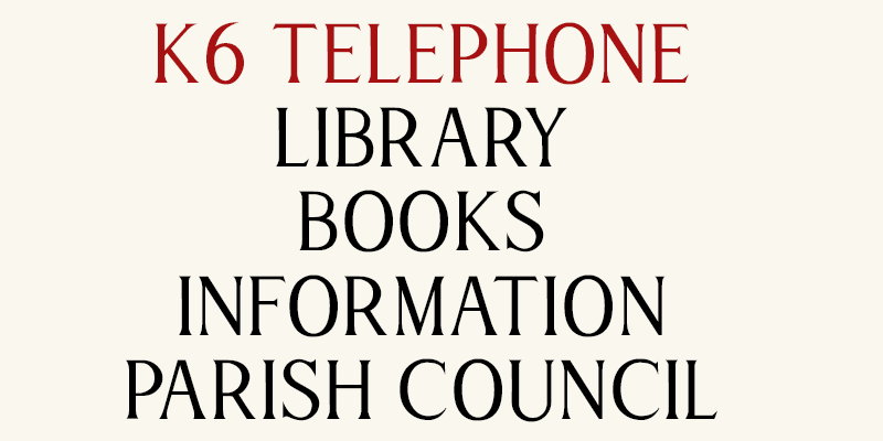
If you’d like to use your own wording on a traditional phone box, now you can. The ‘K6 Telephone’ font has been designed specifically for the illuminated glass signs of telephone boxes by a parishioner in Avonwick, and is available to download and use free of charge.
It’s a very simple font: it’s all capitals, with numbers and basic punctuation. It’s slightly narrower than the original TELEPHONE lettering (to be precise, it’s designed to fit the word ‘defibrillator’ on the glass) but you can stretch it to fit as you want.
We think it’s the ideal telephone box font for a K6 phone box.